We Are Guardians of the Grid
“HDC”
Agency/Role
Moncur / Art Director, Designer

The Challenge
This branding concept was developed to help the company visualize their emerging identity, providing a tangible vision as they established their new brand. Focused on portraying the company as a protective layer between its employees and the communities it impacts, the design aimed to communicate both safety and strength.
Color & Visual Identity
Dark, grounding colors anchor the brand’s aesthetic, creating a sense of stability and resilience. These deep tones are balanced with vibrant oranges that emphasize energy and a commitment to safety—qualities central to the brand’s identity. Together, the colors convey both a bold presence and a vital promise of protection.
Typography
Approachable and modern, the typography offers a friendly edge, aligning with the brand’s mission to connect with both employees and the community. This font choice enhances the brand’s accessibility while retaining a professional, trustworthy appearance.
Iconography & Patterns
Icons and patterns reinforce the brand’s role as a safeguard, embodying the concept of a protective layer that surrounds all aspects of the business. These elements add visual depth, symbolizing the company’s commitment to safety and reinforcing its impact in a tangible, memorable way.
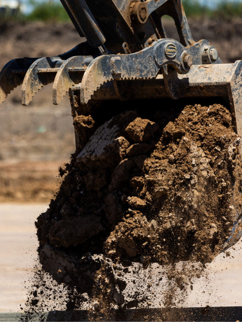
Photography
Photography choices bring an edge to the brand, capturing a glimpse of the company’s dedication to protection. The imagery subtly underscores the brand’s strength and responsibility, highlighting the commitment to secure and serve.


Explore More Work
DirtRocks
DirtRocks
OAC Capital Advisors
OAC Capital Advisors
Protected: Clordisys